Brand identity · Website
InspirED BC
An education non-profit in British Columbia, Canada, supporting teachers, Muslim youth and families. The brand was created together with a small team of designers, and I designed the website.
- Role
- Brand design in a team, website designer
- Year
- 2025
- Team
- 3 stakeholders, 1 product manager, 1 developer and me
- Tools
- Pencil, Figma
Task
InspirED BC was entering its setup phase and needed a clear, credible and inspiring brand. It had to set the organisation apart in education and the non-profit world, earn the trust of families, schools, funders and policymakers, and present it as both a movement and an institution-builder.
The goal for the next 3–5 years: to be recognised as BC’s trusted hub for Muslim education and wellness, with each programme known as its own area of impact.
Overview
The brand personality came first: inspiring, grounded in faith, professional and credible, bold and innovative. Six values sit underneath it: faith, excellence, equity, integrity, support and community.
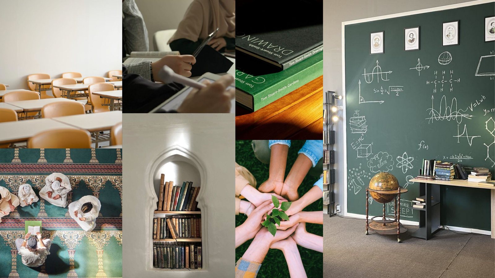
A moodboard of classrooms, books, mosques and growing plants then set the feeling: calm greens, warm wood and natural light.
Concepts
The team put ideas on paper first: a candle, a flame, an open book and the letter “i”. Three of them grew into full concepts, each tested on white, on colour and on real objects.
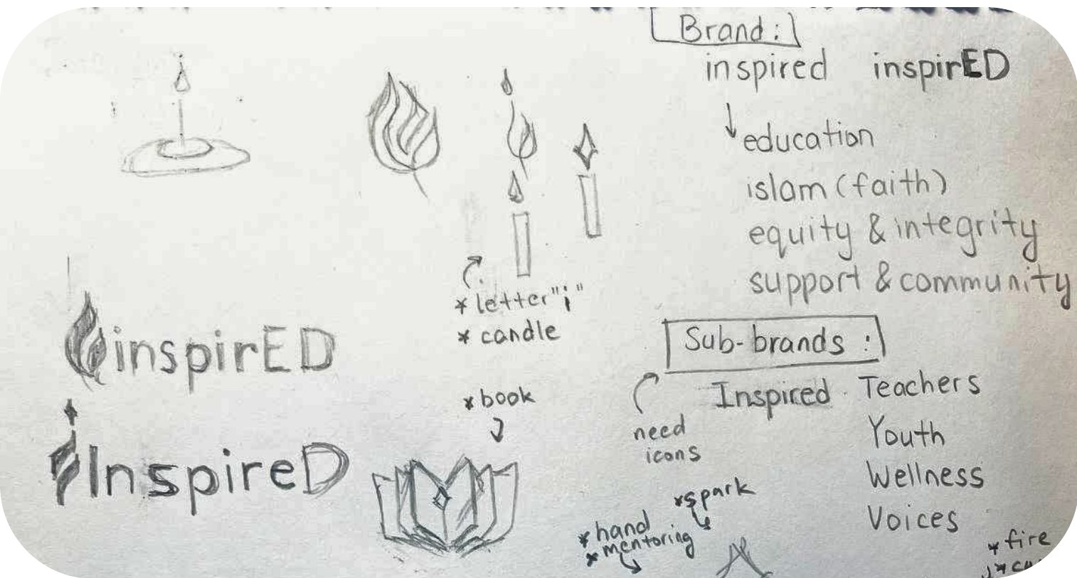


- Sketches on paper
- The drop
- The flame
- The open book
Logo
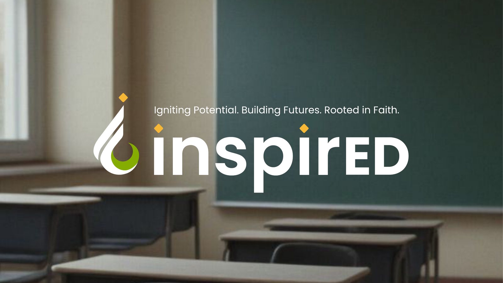
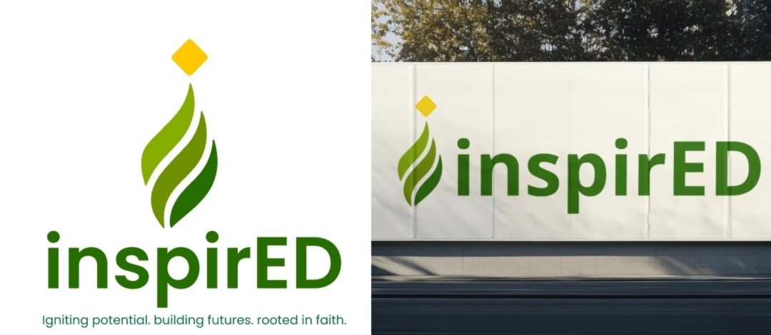
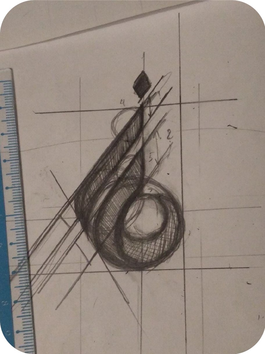
The final mark brings the drop and the flame together into the letter “i”: a seed rooted in faith, a flame of inspiration reaching upward, and a crescent moon. It was drawn by hand on a grid first, then rebuilt in vector.
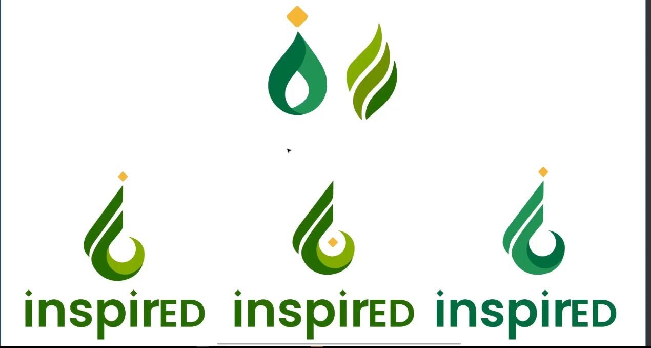


- Drop and flame merged
- Construction by hand
- Built on a grid
- Final logo
Guideline
Programme logos
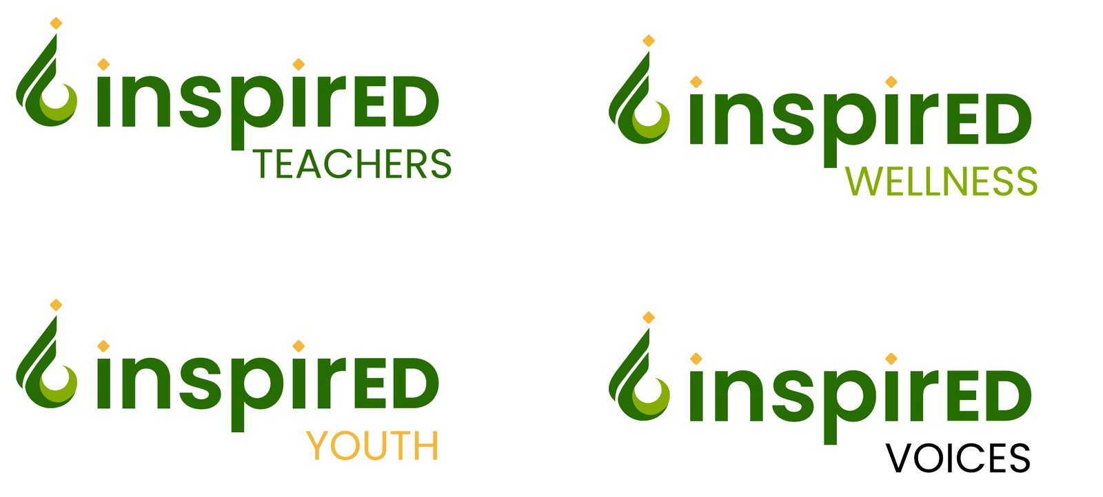
One system for four programmes: Teachers, Youth, Wellness and Voices. The mark stays the same and only the programme name changes colour.
Colours and type
Two greens for growth and faith, and a warm yellow taken from the diamond above the “i”. Poppins for headings, SF Pro Display for text.
In use
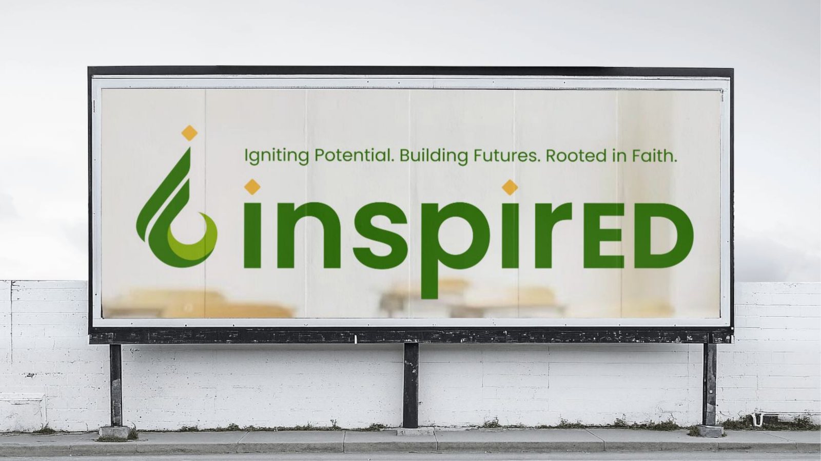
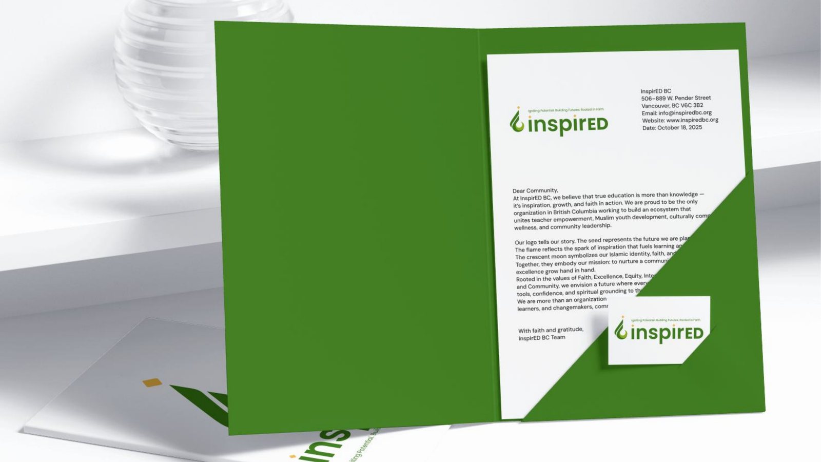
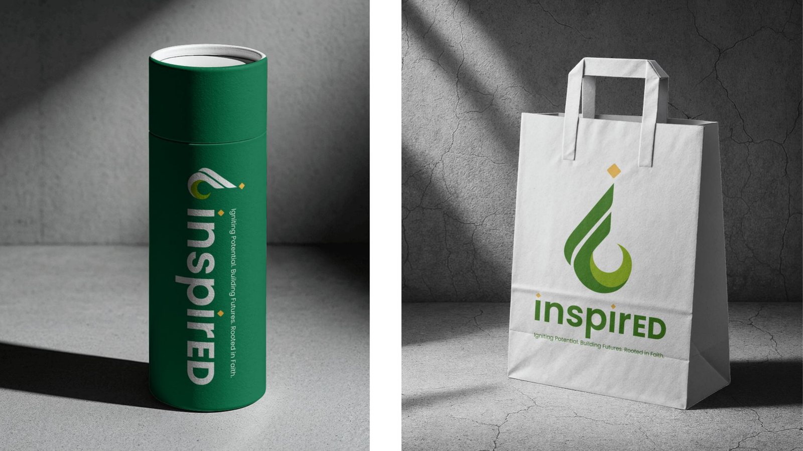
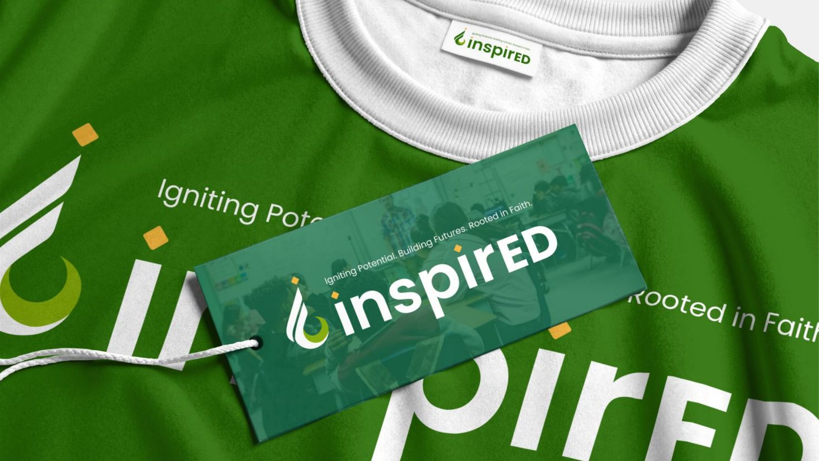
The brand on print, packaging and merch, so the team could see it beyond the screen.
Website
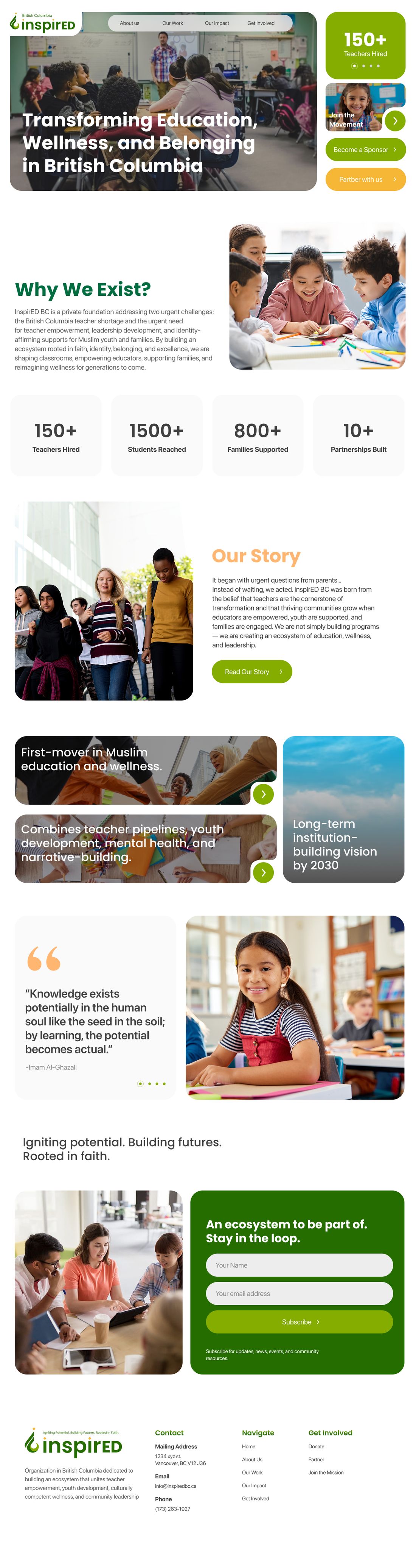
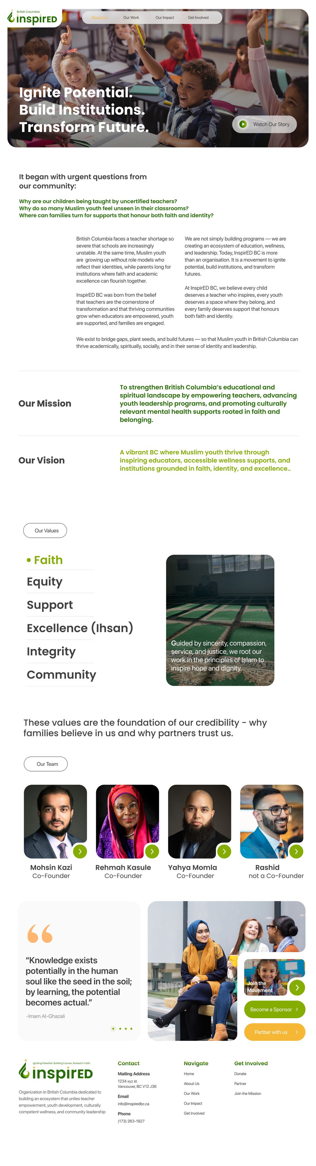
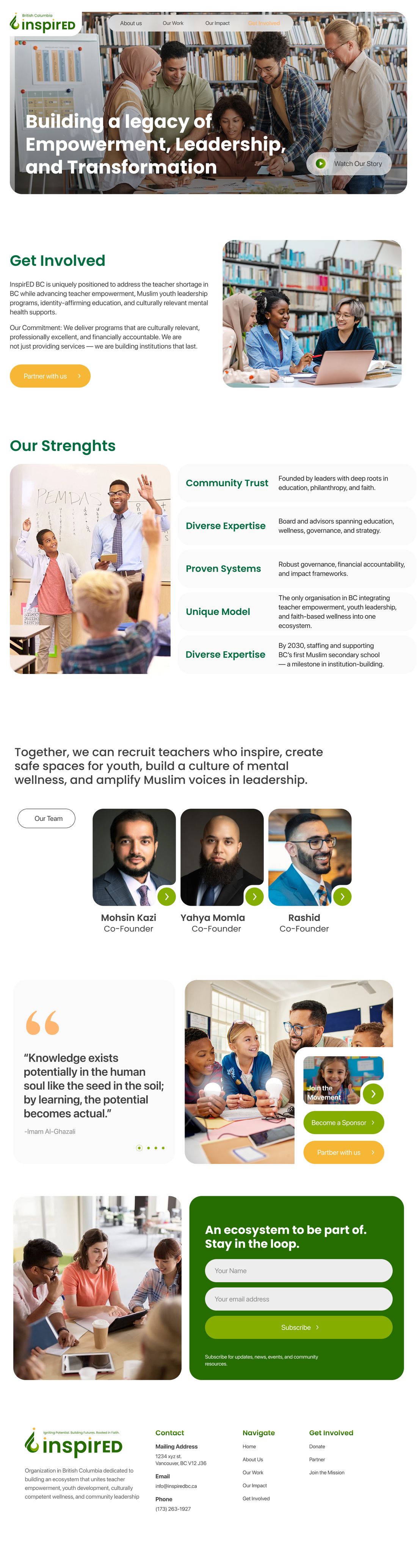
I designed the landing page in Figma, and our developer built it in Webflow. The first screen says what InspirED does and offers three clear actions: partner, donate or join. Below are the programmes, the impact and ways to get involved.
The page uses a bento layout: lots of information summarised in small blocks you can take in one at a time. It also echoes a classroom wall, where students move their attention from one drawing to the next.
Visual design
Every page shares the same bento grid, rounded cards and calm greens, so the site feels like one place.